


Teal To Orange: A Quick Reflection
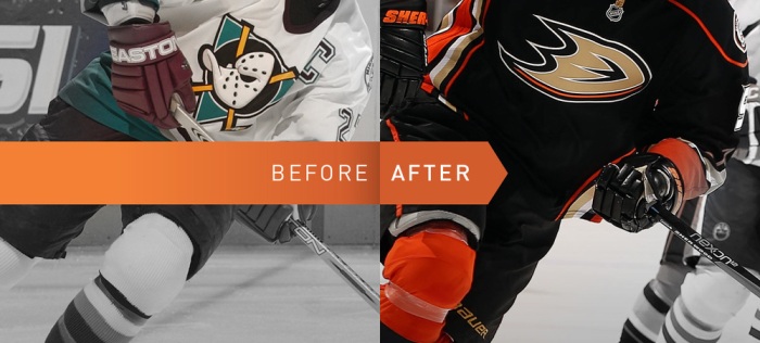
Photo: http://fanbrandz.com/
By George Castner III
With the NHL Draft quickly approaching and the Anaheim Ducks 25th Anniversary season following it, this is the perfect time to take a step back and reflect on the team. A then and now look at the Anaheim Ducks. I want to get into just the look and feel of the team, not the players. The game has changed drastically since 1993 and comparing some of the greatest players such as Teemu to current starts like Cam would be like comparing apples to oranges.
Name Change
First is the name change. Taking a trip down memory lane, we remember that they were the Mighty Ducks of Anaheim. This name is one that followed them up until 2006. In 2006 they shortened the name to the still used Anaheim Ducks. But there are still those that call for the, ‘Mighty’ title to make its return. While Mighty Ducks of Anaheim can be a bit of a mouth full to say, Anaheim Mighty Ducks can flow. However the fanbase does seem to be divided when it comes to the old name and logo; personally, as much as I love the old name, I prefer it being just Anaheim Ducks. But we all know that we are, ‘Forever Mighty’.
The Logo
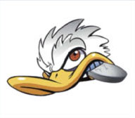
Next, and briefly touched on during the name change, the logo. During the 2006 rebranding, the name was not the only thing that changed. The cartoony Disney inspired logo was swapped out for a wordmark logo. That logo was only a temporary placeholder though. It was used for the fans, and NHL overall, to adapt to the new rebranding. The current logo made its first appearance in 2010 as an alternate. It remained that way up until 2014 when it became the main, and currently used, logo. However, the original Mighty Ducks logo was not done. On the 2010 alternate, the now current, jerseys there was a shoulder patch that featured the Mighty Ducks crest but reskinned in modern colors. But the Mighty Ducks logo still was not done with the team, it returned as the alternate logo and jersey during the 2015 season. Unfortunately, with the switch to Adidas, there were no third jerseys so the Mighty Ducks alternate took the season off.
Recently, and especially with the 25th anniversary at hand, some fans have been calling for the Mighty Ducks logo to return as the main logo and for the Webbed D to become the alternate. This, much like the name change, is pretty divided among the fan base. Some say that the Mighty Ducks crest is too cartoony and kiddish, often recalling its Disney Origins. But those on the other side claim that the Webbed D is too bland and not recognizable by casual hockey viewers. Both bring up decent points but the biggest monkey wrench about to be thrown into the debate is the return of third jerseys. Adidas and the NHL will allow teams to wear alternate jerseys in the 2018-19 season, so will we see a return of the Mighty Ducks logo as the primary, will it return as the alternate, or does it make a return at all? Perhaps the Ducks Organization goes in a completely different direction for the upcoming season.
The Jerseys
Third and linked with the previous reflection, the jerseys. Now, love it or hate it, the Mighty Ducks of Anaheim jerseys became iconic. They even ranked 3rd in the NHL’s Greatest Uniforms poll. The jade and eggplant colored jerseys lasted from 1993 until 2006. They made a brief cameo in 2013 on a throwback night but have not returned since. During the 2006 transition, the jerseys changed to reflect the rebranding. These jerseys, much like the wordmark logo, saw action until 2014 when they were replaced with the current ones. These current jerseys have been received well by the fans. Most fans love how much orange they have and how they incorporate the old and the new. With that being said though, many love the orange jersey with the old Mighty Ducks crest. The color continues to grow as the team does, especially with their playoff tagline, “Paint It Orange”.
Color Scheme
Speaking of painting it orange, the whole team has had a completely new paint job since 2006. Back when the team first started their colors were: jade, eggplant, silver, and white. A color palette that is clearly ripped from the 90’s. It fit in perfectly then but by current standards is outdated, and that was a key change in the 2006 rebranding. The 90’s were over and it was time that the Ducks showed the world what they were soon to become (Stanley Cup Champions). The teal and eggplant were swapped out for black and gold, the silver became orange, and the white stayed. It was a sleeker, more modern, design and one that the fans quickly gravitated to. But as the years went by orange became more and more important to the team and its fans. It has slowly grown into the primary colors being orange and black with gold and white accents. What does this mean when looking at the 25th anniversary and onwards? Whether it is this year, next year, or 5 years from now orange will continue to grow and be a staple of the team. Anaheim Duck’s management has stated about transitioning to an orange jersey in the 2018-19 season but with the return of the thirds will we really see this transition? Will Anaheim switch out the third for the new home and then ditch the third jersey all together? Regardless, the future of the Ducks is orange and the jerseys, be it the home or the alternate that will continue to reflect.
Anaheim Legacy
Lastly, and arguably most important, the legacy that the team is leaving behind. Back in 1993, the Ducks did not have much respect in the eyes of most NHL fans. Many of them thought they were a joke team, a “Mickey Mouse Club”, and one that would not have lasted. Heavy criticisms came from the “Mighty” in the name and the cartoony logo. Granted Anaheim did not help this with their first home game opening ceremony or any of the other things that Disney did while they owned the team; but the legacy of a joke team came to an abrupt end in the 2003 Stanley Cup Playoffs when the Mighty Ducks swept the Detroit Red Wings, made it all the way to the Stanley Cup Finals, and lost in game 7. That year was the moment that people realized that the Ducks were not a joke of a team but a rising threat in the west. They took a step back in the following year but bounced back after the 2004-05 lockout, finishing 3rd in the Pacific. Then in 2007, they steamrolled their way to their first Stanley Cup. Since then they have been a dominant force in the west, making the playoffs in 2008, 2009, 2011, 2013, 2014, 2015, 2016, 2017, and 2018. Of which they made it to the Conference Finals twice (2015 and 2017). The Anaheim Ducks have built a strong reputation and even though this year’s playoff sweep still stings, the Ducks have shown that they will come back. After all… they are the comeback kids.
Recent Articles:
POLL: Is Perry’s Time Up In Anaheim?
Want to start your sports media career? Then Join The Puck Network!
DucksNPucks is part of The Puck Network, which covers the entire NHL. There are openings to cover your favorite team(s) and earn school credits! If you are interested, then apply by filling out the form here: Join Our Team. What are you waiting for? Start your sports media career TODAY!
June 10th, 2018
PICK A TEAM
chigago blackhawks
Chi-Town Hawks
anaheim ducks
Ducks N Pucks
boston bruins
Bruin Strong
carolina hurricanes
Carolina Caniacs
colorado avalanche
Denver Avs
arizona coyotes
Coyotes Howl

Buffalo sabres
Sabres Den

columbus blue jackets
Blue Jacket Army

dallas stars
Shootout Stars

calgary flames
Fierce Flames
detroit red wings
Red Wings Town
new york islanders
Long island Pucks
minnesota wild
Rink Wild
edmonton oilers
Ice Oilers
florida panthers
Roaring Panthers
new york rangers
Fighting Rangers
nashville predators
Preds N Pucks
los angeles kings
LA Royalty

montreal canadiens
Hockey Habs
new jersey devils
Puck Devils
st.louis blues
Break Away Blues
san jose sharks
Bay Sharks
ottawa senators
Slap Shot Sens
philadelphia flyers
Furious Flyers
winnipeg jets
High Flying Jets

vancouver canucks
Canucks N Pucks
tampa bay lightning
Bay Bolts
pittsburgh
Pens N Pucks

toronto maple Leafs
Just Leafs
washington capitals
Capital Pucks